


When people think about branding for social cooperatives or public institutions, they often still think of logos, colour palettes or websites. In reality, designing an identity for organisations that provide services to people involves tackling a much broader challenge: making existing services understandable, accessible and recognisable.
As we discussed in last month’s article, a brand does more than communicate what an organisation is. It helps people find their way, understand where to look for support and feel welcome even before they come into contact with a service. This is why Studio Shift’s work has increasingly moved from designing individual communication assets to building communication ecosystems in recent years: identities that grow alongside services, evolve over time and accompany people throughout their journey.
Designing access, beyond communication
Every service or project is created in response to a specific need. Communication is often not a problem due to a lack of content, but rather because it is difficult to make complex and diverse services easy to understand. Sometimes, people need help to recognise themselves as potential beneficiaries, understand how to access a service or realise when it could be useful to them.
For this reason, branding in the public and social sectors has a different purpose to that in the commercial world. It is about creating connections between different services and improving the user experience. This work involves every touchpoint, including websites, social media, written communications, physical spaces and the way professionals and institutions interact with citizens and families.
Every interaction helps build trust. Every element communicates what it means to care for people, often unconsciously. Here are two examples of what this looks like in practice.
This approach has guided our collaboration with Cooperativa Sociale Itaca since 2023. Mi Sento, a project by Alessia Vannini, Aline Di Campi, Federica Polverari, Giulia Barone, Letizia Tresoldi, Valentina Lupi and Simone Bali — was originally launched as the winning concept of the “Promoting Mental Health Through Innovative Services” Design Sprint.
The designers started the project as a communication campaign dedicated to preventing mental health problems and promoting emotional wellbeing among young people. The idea was simple: to take the conversation beyond institutional settings and reach teenagers and young adults in their everyday environments. Through stickers placed in schools, parks, and sports centres, the campaign invites people to stop, reflect, and share how they feel by responding to open-ended questions. The collected responses then inform digital content, fostering an ongoing dialogue between local communities and online communication.
More than just a campaign, Mi Sento has become an emotional awareness experience, transforming everyday moments into opportunities for listening, reflection and conversation.
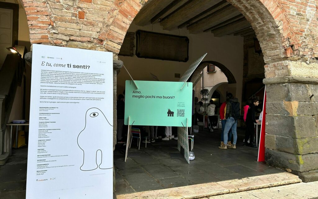
Photos from the interactive exhibition “Mi Sento“
Strongly believing in this approach, Cooperativa Itaca continued to develop the project over the following years. In collaboration with ASC Solidalia and Cooperativa CAF, the campaign evolved into an interactive travelling exhibition designed to support young people in exploring mental health through themes such as emotions, body image, relationships, and the challenges of growing up. Thanks to its modular, transportable structure, Mi Sento can now be hosted in schools, educational centres, and community spaces, adapting naturally to different contexts.
The most significant development occurred in 2025 when Cooperativa Itaca brought together several youth mental health initiatives within a single ecosystem, providing clearer and more accessible services. This resulted in the creation of Mi Sento EASY.
An identity that helps people navigate
For EASY, the challenge involved much more than designing a new logo. The goal was to create a system that would help young people, families, and professionals to navigate different services in a way that did not make them feel disconnected, stigmatised, or intimidated.
To achieve this, we designed a visual and narrative identity. The website became the gateway to the entire ecosystem, primarily addressing parents and service providers. Meanwhile, social media channels tell the story of activities and opportunities across the local area, using language that resonates with the project’s young audience.
A series of illustrated characters guides the user experience, with each one representing a specific service. They are not just mascots, but orientation tools that help users to immediately recognise different service areas and make them more memorable. They also present the language of mental wellbeing in a lighter, more approachable, informal and accessible way.
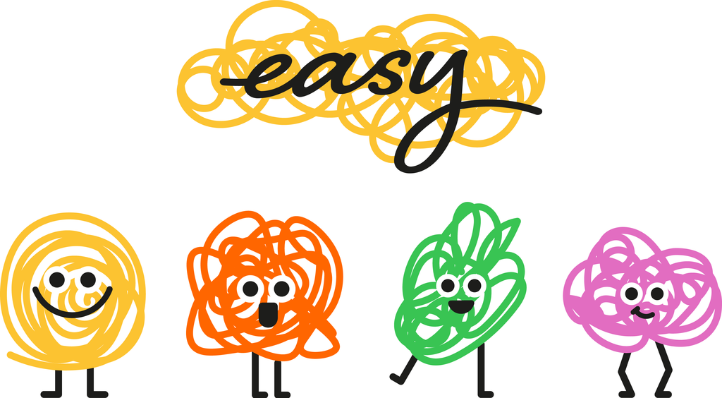
Logo and mascot for the Easy service
The logo follows the same philosophy. Its hand-drawn lettering conveys closeness and spontaneity, while the soft lines surrounding it evoke the complexity of thoughts and emotions. It is a doodle that represents not confusion, but the possibility of discovering new meanings and connections.
In this way, the identity becomes an integral part of the service itself, helping people to find their way even before they ask for support.
RISE: Designing continuity across services
Clear information, accessible user journeys and thoughtful aesthetics are the ingredients and outcomes of the same design approach. These principles also guided our work with the public authority Ambito Territoriale e Sociale di Merate in developing the RISE – Centro per la Famiglia project.
This project was part of a wider collaboration to define the institution’s overall identity and communication strategy.
Therefore, when RISE was established, the challenge was not to create an entirely new brand, but to design an identity that could work in dialogue with the Ambito’s evolving identity, functioning as one of its expressions while maintaining coherence and a distinctive voice.
We started with the visual elements that characterised the Ambito’s identity: a system of interconnected circles of different sizes and colours that overlap and meet to form an ever-evolving network.
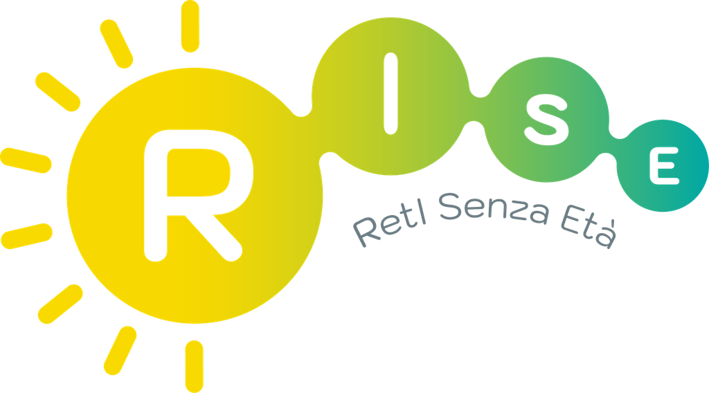
Logo of the Family Centre of Ambito Territoriale Sociale di Merate: RISE
For RISE, this visual language developed in a new direction. The interconnected circles suggest the image of a rising sun — a metaphor for growth, openness, and new beginnings — which resonates with both the name ‘RISE’ and the Family Centre’s mission to support families at every stage of life.
The colour system also reflects this evolution. The gradients are not just an aesthetic choice; they symbolise continuous transformation, the transition from one stage to another and growth through encounters between people, expertise and relationships.
RISE’s identity does not exist in isolation, but as part of a broader visual system, strengthening the Ambito’s language while preserving its values and expanding its ability to communicate new services.
The RISE identity extends beyond digital communication into the centre’s physical environment. To support visitors throughout their experience, we have designed a coordinated environmental graphics system including window graphics, entrance wayfinding elements, and identification markers for different areas and offices to help people navigate the space more intuitively.
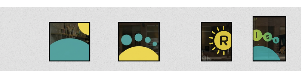
Design for the window decals at the RISE Family Centre
When identity becomes infrastructure
Both EASY and RISE illustrate a deeper shift in the way we design communication for the public and social sectors. The challenge is no longer just to create a logo or launch a campaign; it is also to build systems that can evolve alongside services and support this process, making it easier for people to access opportunities.
When branding becomes a tool for orientation, communication moves beyond the surface level of a project to become an integral part of the service experience.
Design can generate its greatest impact precisely in this space, transforming complexity into clarity, building trust and bringing public and social services closer to the communities they are created to serve.
Anna Pozzoni – August 17, 2026

Make a Shift is Studio Shift's e-magazine, focused on design and social innovation, where you can find articles and case histories of our projects.
Go to articles