

When we talk about inclusive design, we’re not just referring to visually pleasing aesthetics, but above all to a design approach that responds to everyone’s needs — no one excluded.
At Studio SHIFT, we know this well: over the years, we’ve poured our creativity and expertise into projects that aim to create more welcoming, stimulating, and respectful environments for all kinds of differences.
But what does it really mean to design inclusively? It means putting people at the center — understanding their cognitive, emotional, sensory, and social needs — and translating those needs into concrete solutions: colors, furnishings, signage, paths, languages.
Today, we want to share three special projects where we applied the inclusive design paradigm to transform both spaces and lives.
“Glicine” and “Casa Fregonara”: the power of color
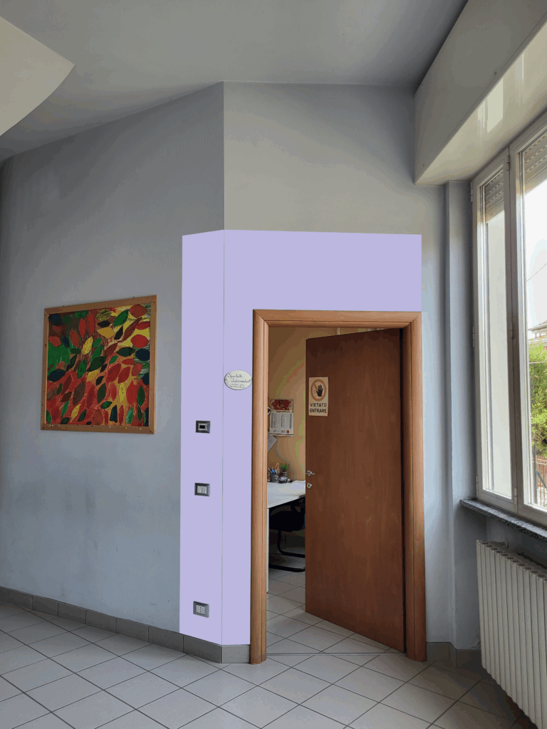
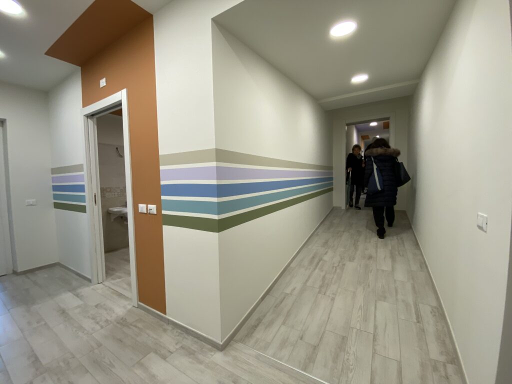
In the “Glicine” and “Casa Fregonara” projects, developed for Anffas Borgomanero and Anffas Novara, Studio SHIFT created inclusive color plans aimed at rethinking existing spaces and making them better suited to the orientation and routine support needs of people with disabilities.
Every color choice was carefully studied, taking into account how people cognitively and emotionally respond to chromatic stimuli. The color palettes were selected to enhance spatial orientation, reduce anxiety and stress, and encourage autonomy.
The result? Spaces that are more livable, welcoming, and functional—places where users can feel more independent, and truly at home.
“Reti Blu”: signage and autism-friendly design
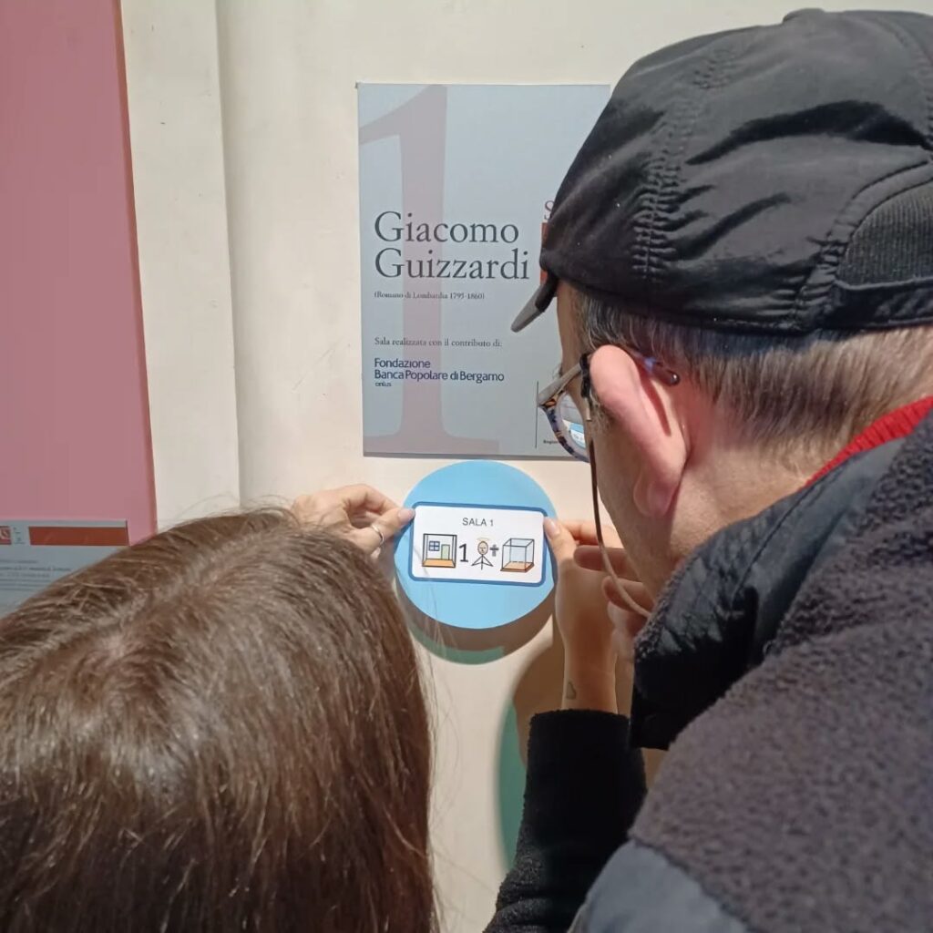
“Reti Blu” is a project launched in collaboration with Cooperativa Sociale Itaca and supported by Regione Lombardia. It introduces an innovative approach to make shared public spaces more accessible and understandable for people with autism.
Set in Romano di Lombardia, the project involved working closely with the local network and Spazio Autismo staff to design Augmentative and Alternative Communication (AAC) solutions integrated into the signage of selected locations (schools, public offices, gym, ranch, local museum, and partner cafés).
At the heart of the initiative are co-design workshops involving citizens, shop owners, educators, and families — crucial participatory moments where we listen, gather real needs, and co-create concrete inclusive communication tools.
Our intervention focused on three key areas:
- Socialization: creating contexts that promote interaction, dialogue, and participation.
- Learning: developing visual and digital aids to support understanding and memory.
- Autism-Friendly Environments: designing more readable and reassuring public spaces, with clear, consistent, icon-based signage.
Reti Blu puts people at the center and works to build a stronger, more aware social network. It’s a powerful example of how design can become a tool of care and inclusion.
Inclusive Design: a choice that makes a difference
These projects teach us something valuable: it’s the way we imagine and build environments that allows us to embrace diversity and turn it into a strength.
At Studio SHIFT, we believe that every project — big or small — is an opportunity to shape a more inclusive world. If you’re thinking about reimagining your spaces or services through this lens, let’s talk. Together, we can design a future where no one is left behind.

Make a Shift is Studio Shift's e-magazine, focused on design and social innovation, where you can find articles and case histories of our projects.
Go to articles